final film
loishigginsA2
Tuesday, 1 April 2014
Wednesday, 26 March 2014
Audience Feed Back
Audience feed back
You can see from the audience feed back videos and the first and final drafts of our trailer that we made subtle changes. You can also see very small editing changes that we have made also. The main change though is the music we completely removed it from the beginning of the trailer. We had a lot of feedback from our friends, family and teachers. We also were advised to get rid of the blurred music we had in the back ground of Chloe waking up as it didn’t make sense. We also put the ‘‘Best seller by Rupert Browning’’ into the foreground of the girls getting ready. We put some background music also when Chloe is on the phone to Frankie. The final change was the bathroom scene, it was too long and lacked purpose so we shortened it to make it fit in more. After looking at the trailer with all audience feedback changes we are very happy with final result.
Youtube
Youtube is a website that allows you to share comment and
like videos.
The types of video they show are:
Music video
Movie trailers
Documentaries
Interviews
Tutorials
I you youtube mainly to research trailers and to watch
tutorials videos for final cut express. Using youtube we was able to research
the ‘‘blind side’’ and ‘‘remember me’’ the two main inspirations for our
trailer.
Google
When we could find the answer for something this search
engine came in very handy. We used research from Google for our age our genre
research and age restriction. With the handy typing bar, this meant we could
type in any query we may have had about any of the software we were using and
would usually get the answer straight away.
Final cut express
This is what we used to edit all or our footage for our
trailer. This was the software that we knew the most about how ever we also
needed both wiki how and youtube to show us everything.
Wiki how
Wiki how is like a search engine but your question and queries
are answered by real people. This made things a little simpler for me and some
of my group as sometimes we couldn’t understand the technical jargon.
Blogger
We used blogger to document our data and help us create a
diary of all of our work. We had used it in foundation so it wasn’t hard to
grasp once we all got the hang of it again.
Tuesday, 25 March 2014
How effective is the combination of your main product and ancillary texts?
What type of promotional package did you want to create?
We wanted to create a melodrama that was targeted towards
teenagers and young women. Our age range was 15 – 25. We always hoped however
for a small niche audience of mother watching the film with their daughters. We
aimed for our audience to be female as we wanted to connect with the audience on
an emotional level. Our niche audience we imagined to be 35-55 and we thought
they would probably enjoy the film as they have life experience and can connect
with the idea of having a baby.
Do the three elements work together?
The trailer poster and film in my opinion work together very
well. I think that the film trailer works perfectly with the audience we have
chosen and is a success. I think the young sweet and almost a bit naive
characters express what people in our target audience are like at this age. The
poster shows the friendship between them being unbreakable and the film
magazine depicts an emotional journey.
What elements do you think are successful in each product?
Film poster – the way we follow all the convections made it
look very professional.
Trailer – the best element was the music I think we worked
hard on that and it truly paid off. The music for each scene was very fitted
and chattered to that scene.
Magazine – I think the advertisements on the magazines are
very professional looking. This adds to our magazine very well as the picture
is a little gloomy it brightens the whole magazine up.
What difficulties have you overcome?
We had some major issue with Photoshop. However we overcome
this by finding new ways to edit our pictures, using publisher power point and
paint.
What weaknesses do you think each product has?
Film poster – we couldn’t get the correct font for the
billing bloke.
Trailer – the camera work in some scenes could be a lot
better.
Magazine – the background and the foreground (picture of Emily)
needed to be blended better.
Monday, 24 March 2014
In what ways does your media product use, develop or challenge forms and conventions of real media products?
We use a typical production company, for the type of film we
made. I think this shows we conformed to real media and that we used our knowledge
wisely to make our film seem as professional as we possibly could. We also used
touchstone at the very start of our trailer, which is what we had seen in all
the other trailers we had observed. This also made our project very professional
looking as the structure was on point with all other professional trailers.
We already knew that all trailers had to be U ratings, so
they could be shown on television before the watershed. So I think we made a
smart, and conventional move when we added this to our trailer. This rating
card starts at the very begging of most trailers. It made our work look very professional
and very suitable to watch.
Not many films that we found used quotations from magazines
or newspapers. I believe this challenges convention because we really wanted
something such as a review to make our film look at good as we possibly could. I
think this was a good move on our part as it showed we wanted to go that little
bit extra for our film and push the boundaries a little.
This scene is perfect to attract the audience, as it creates
drama effortlessly. Straight way when you see it you immediately want to know
what is going on and why. This also create suspense in our trailer as you’re
not too sure where it links in with the story until you find out she is pregnant.
I think the camera work here really speaks to the audience here
as the it is completely level with both of the actors no one is being spoken
down to. This in this emotional situation is very important. The location of
this is very picturesque and secluded which is what we wanted from this scene. The
prop used in this is also very effective, we used a umbrella to make the
friends stand closer together and to make the conversation seem more private. This
also gave our audience a main force point.
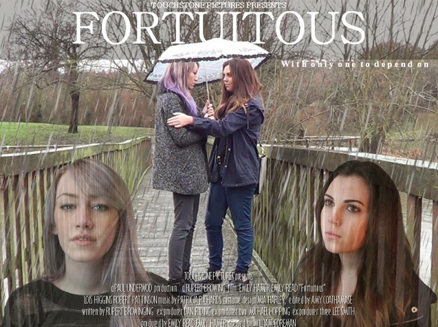
 When making our film poster we stuck to a lot of convections.We made the title bold as we could because we wanted it to
be a main focus point.
The quotation ‘‘only one person to depend on’’ was also something
that was highly convectional on a film poster. With all the other film posters
we had reviewed we saw a pattern of small quotes on film posters.We also did a billing block which is seen as very conventional.
There a little problem with the font but nothing that I would consider to challenge
convection.
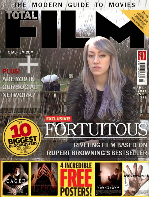
 When it came to our magazine we chose to go with Total Film.
We chose them as they seemed to be the most conversional film magazine. We followed
Total Films media convections very closely. We used the main character on the
foreground of the very front. Then in the background we used a rainy scene for
representation of what is to come for young Chloe. The main characters on Total
Film usually have expressionless faces, and also stare into the distance. We used
a lot of advertising for other films on our magazine. This was to make our
magazine look really professional.
Film poster
 When making our film poster we stuck to a lot of convections.We made the title bold as we could because we wanted it to
be a main focus point.
Film magazine
 When it came to our magazine we chose to go with Total Film.
We chose them as they seemed to be the most conversional film magazine. We followed
Total Films media convections very closely. We used the main character on the
foreground of the very front. Then in the background we used a rainy scene for
representation of what is to come for young Chloe. The main characters on Total
Film usually have expressionless faces, and also stare into the distance. We used
a lot of advertising for other films on our magazine. This was to make our
magazine look really professional.
 Sunday, 23 March 2014
Editing Magazine
We took inspiration for our film magazine from the magazine
of the hunger games.
We really loved the way that Jenifer Lawrence is surrounded
by flames, as the film is an adventure. That
is why we used the rain to etherize the tragedy that lies ahead of her. We also
loved the set out of the way the magazine shows other films being advertised.
Many of the shapes we used for our film poster where
original made on power point. The film poster wasn’t too hard to do we used a
basic picture of Emily Hamer and put in the foreground and for the background
we used a establishing shot at the nature reserve.
We also noticed that other magazines always had text on them
such as ‘‘Top 10 new films of the week’’. So we created our own ‘‘Are you in
our new social network’’, we loved the idea of a rhetorical question for it.
Saturday, 22 March 2014
Film Poster Editing
We attempted to use Photoshop for our poster, but it unfortunately
didn’t work as we hoped. Emily Read then had the idea to use publisher, which
we both agreed was a lot more effective. We also used power point and paint in
office to create the rest or our poster.
We chose an image from the nature reserve as we believed it
to be the most powerful of all the other images. We believed this as we know
this is where Frankie comforts Chloe, after she confesses she is pregnant.
We made sure the title was very immediate to the eye, and we
also added the touchstone pictures presents as that it what we had seen previously
in other movie posters (the name of the production company). Like other movie posters also there is a quotation next the
title ‘‘with only one to depend on’’.
Subscribe to:
Comments (Atom)


