We use a typical production company, for the type of film we
made. I think this shows we conformed to real media and that we used our knowledge
wisely to make our film seem as professional as we possibly could. We also used
touchstone at the very start of our trailer, which is what we had seen in all
the other trailers we had observed. This also made our project very professional
looking as the structure was on point with all other professional trailers.
We already knew that all trailers had to be U ratings, so
they could be shown on television before the watershed. So I think we made a
smart, and conventional move when we added this to our trailer. This rating
card starts at the very begging of most trailers. It made our work look very professional
and very suitable to watch.
Not many films that we found used quotations from magazines
or newspapers. I believe this challenges convention because we really wanted
something such as a review to make our film look at good as we possibly could. I
think this was a good move on our part as it showed we wanted to go that little
bit extra for our film and push the boundaries a little.
This scene is perfect to attract the audience, as it creates
drama effortlessly. Straight way when you see it you immediately want to know
what is going on and why. This also create suspense in our trailer as you’re
not too sure where it links in with the story until you find out she is pregnant.
I think the camera work here really speaks to the audience here
as the it is completely level with both of the actors no one is being spoken
down to. This in this emotional situation is very important. The location of
this is very picturesque and secluded which is what we wanted from this scene. The
prop used in this is also very effective, we used a umbrella to make the
friends stand closer together and to make the conversation seem more private. This
also gave our audience a main force point.
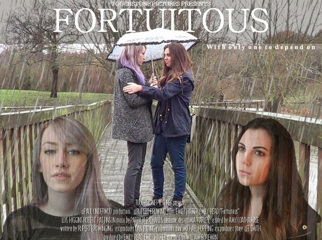
 When making our film poster we stuck to a lot of convections.We made the title bold as we could because we wanted it to
be a main focus point.
The quotation ‘‘only one person to depend on’’ was also something
that was highly convectional on a film poster. With all the other film posters
we had reviewed we saw a pattern of small quotes on film posters.We also did a billing block which is seen as very conventional.
There a little problem with the font but nothing that I would consider to challenge
convection.
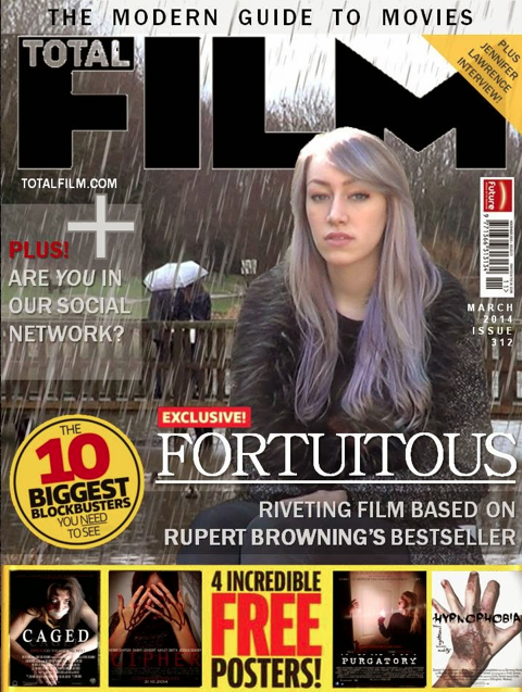
 When it came to our magazine we chose to go with Total Film.
We chose them as they seemed to be the most conversional film magazine. We followed
Total Films media convections very closely. We used the main character on the
foreground of the very front. Then in the background we used a rainy scene for
representation of what is to come for young Chloe. The main characters on Total
Film usually have expressionless faces, and also stare into the distance. We used
a lot of advertising for other films on our magazine. This was to make our
magazine look really professional.
Film poster
 When making our film poster we stuck to a lot of convections.We made the title bold as we could because we wanted it to
be a main focus point.
Film magazine
 When it came to our magazine we chose to go with Total Film.
We chose them as they seemed to be the most conversional film magazine. We followed
Total Films media convections very closely. We used the main character on the
foreground of the very front. Then in the background we used a rainy scene for
representation of what is to come for young Chloe. The main characters on Total
Film usually have expressionless faces, and also stare into the distance. We used
a lot of advertising for other films on our magazine. This was to make our
magazine look really professional.


No comments:
Post a Comment