What type of promotional package did you want to create?
We wanted to create a melodrama that was targeted towards
teenagers and young women. Our age range was 15 – 25. We always hoped however
for a small niche audience of mother watching the film with their daughters. We
aimed for our audience to be female as we wanted to connect with the audience on
an emotional level. Our niche audience we imagined to be 35-55 and we thought
they would probably enjoy the film as they have life experience and can connect
with the idea of having a baby.
Do the three elements work together?
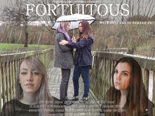
The trailer poster and film in my opinion work together very
well. I think that the film trailer works perfectly with the audience we have
chosen and is a success. I think the young sweet and almost a bit naive
characters express what people in our target audience are like at this age. The
poster shows the friendship between them being unbreakable and the film
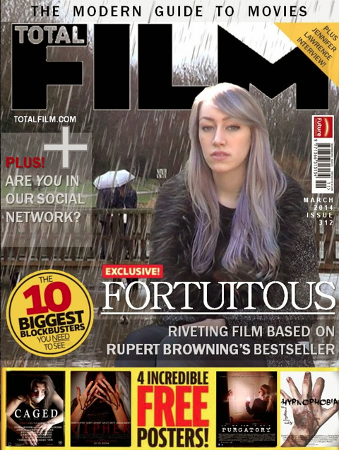
magazine depicts an emotional journey.
What elements do you think are successful in each product?
Film poster – the way we follow all the convections made it
look very professional.
Trailer – the best element was the music I think we worked
hard on that and it truly paid off. The music for each scene was very fitted
and chattered to that scene.
Magazine – I think the advertisements on the magazines are
very professional looking. This adds to our magazine very well as the picture
is a little gloomy it brightens the whole magazine up.
What difficulties have you overcome?
We had some major issue with Photoshop. However we overcome
this by finding new ways to edit our pictures, using publisher power point and
paint.
What weaknesses do you think each product has?
Film poster – we couldn’t get the correct font for the
billing bloke.
Trailer – the camera work in some scenes could be a lot
better.
Magazine – the background and the foreground (picture of Emily)
needed to be blended better.


